Portal
Brand Identity / Visual Identity / Design Sprint / Biotech / Startup
Portal Biotech has developed a genuinely new way to analyse proteins at the molecular level: a nanopore-based platform capable of reading full-length single molecules in one shot, delivering a level of resolution that no existing technology can match. The science works. The challenge was that almost nobody in their target market knew it existed yet.
The brief asked for a refreshed verbal and visual brand identity that could do two things at once: speak credibly to scientifically rigorous decision-makers at biopharma companies and CROs in the near term, while also signalling to Series B investors and strategic partners that Portal is building toward something far larger than a laboratory instrument.
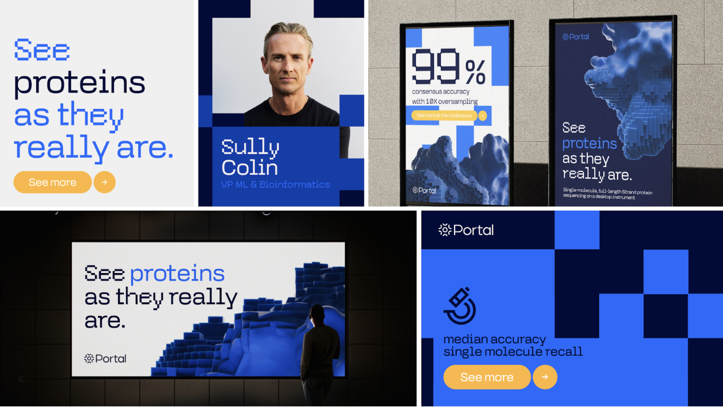
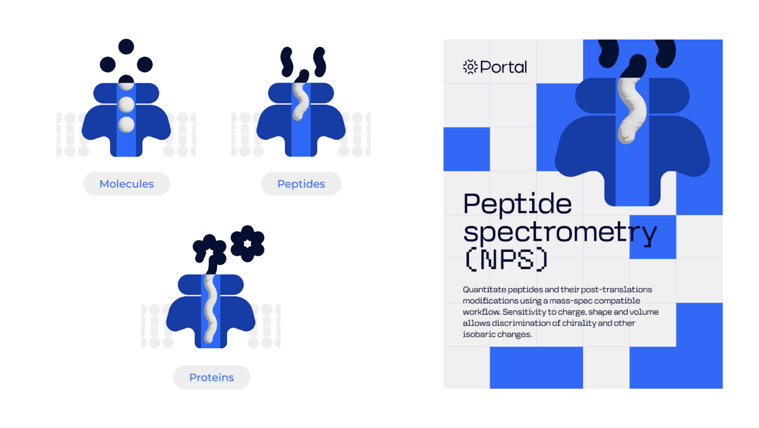
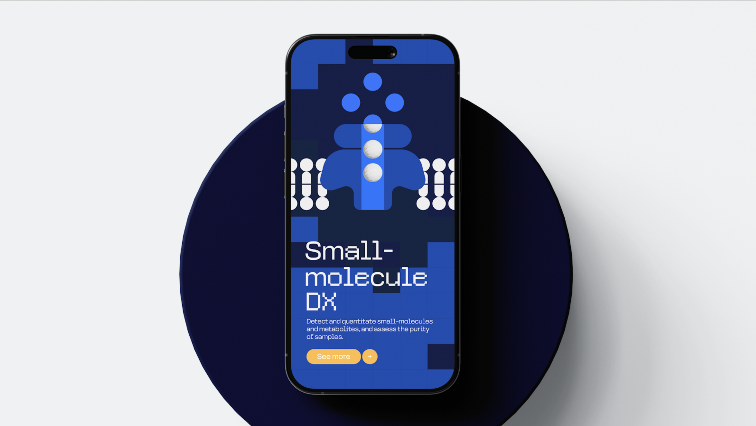
Designing for Portal required understanding an unusual tension. The audience, senior R&D and CMC leaders at large pharmaceutical organisations, are professionally sceptical. They have seen overpromised technology before, they carry real career risk when they champion something new, and they make decisions based on evidence rather than branding. At the same time, Portal needed to communicate genuine ambition, not as a box seller or a service provider, but as the company defining a new category in proteomics.
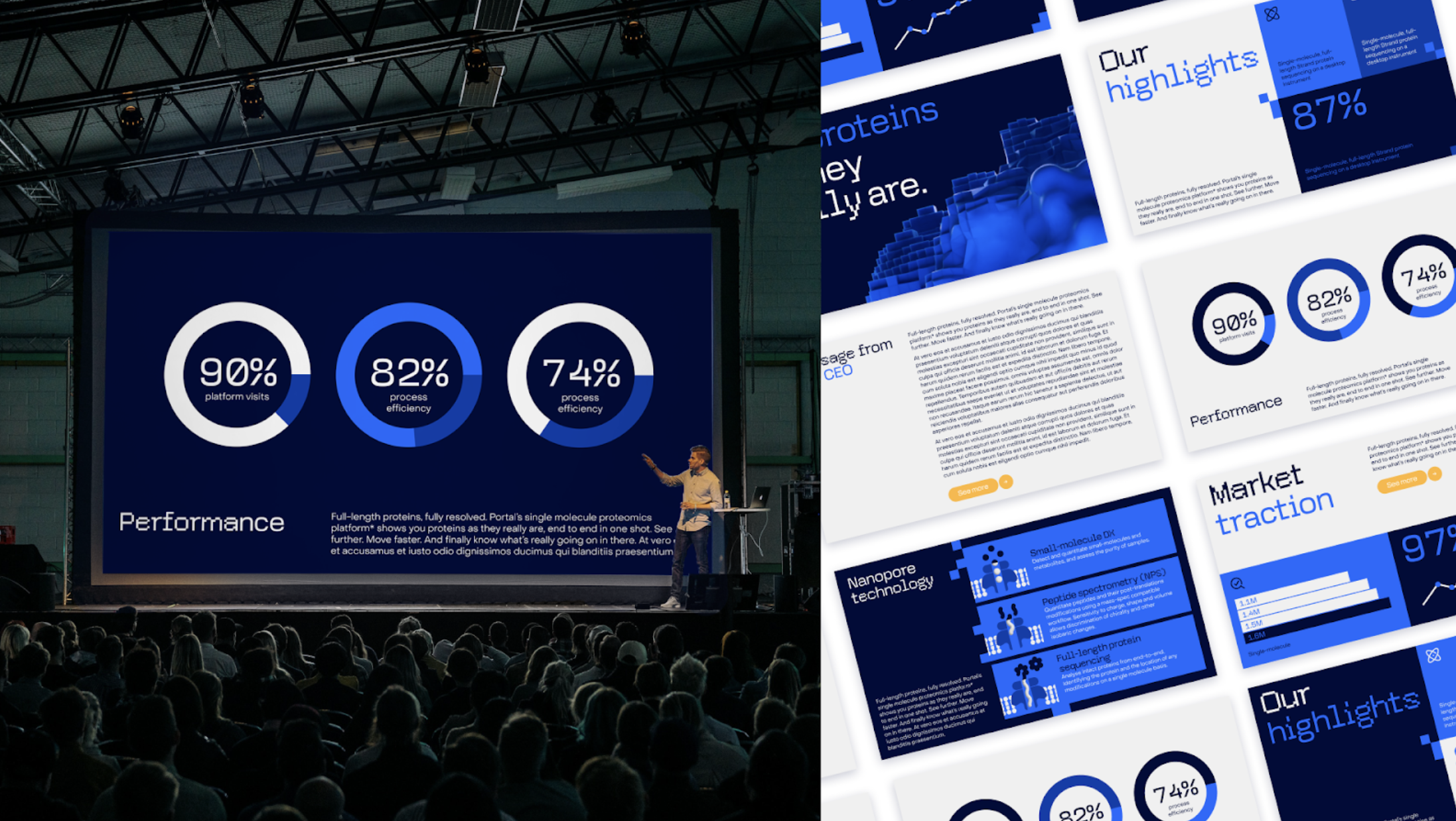
I joined the project as part of TRAFIK's multidisciplinary team working across branding and design. My focus was on the visual identity concept: being part of design sprints to explore how Portal's technology and values could be expressed visually, working with the team on colour, typography, and layout, and contributing to the presentation of the concept back to the Portal team.
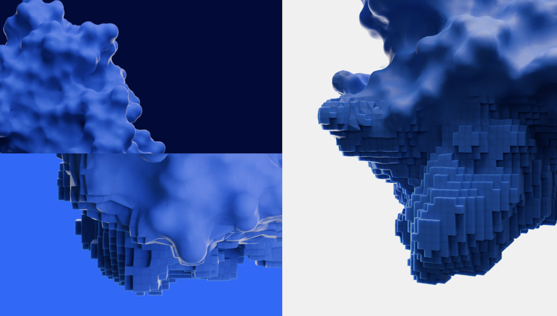
The central insight we built the visual identity around came directly from the technology itself. It reads a single molecule, in full, in one pass. Where existing methods produce a fragmented or blurred picture of a protein sample, Portal produces complete, unambiguous data. The brief itself described the difference as the gap between a heavily pixelated black-and-white snapshot and a full-colour, high-definition video of an individual molecule.
The visual identity was built around the idea of high definition: clarity emerging from complexity, resolution where there was previously blur, the moment something previously invisible becomes sharply, undeniably seen. Rather than reaching for the visual language of typical biotech or laboratory branding, we pushed toward something that felt more like the precision and confidence of the data itself.